
How a joke about funerals helps with UX writing

Image from Startup Stock Photos on Pexels
Demetri Martin is a master of comedic situations. If you’ve never seen him before, he has a sort of dry brand of observational humour, relying more on anecdotes than full stories, and often uses visuals or music to frame jokes so his audience can understand him in a different way.
On the surface he sounds like any other comedian, but what I think makes him brilliant is the way he frames his jokes, and the power of context to illustrate our strange societal quirks.
“When I cross the street I always look both ways. That’s not crazy.” He says. “But if I look both ways any other time in life, then THAT looks crazy.”
Examples:
“Getting a slice of pizza” (he looks both ways carefully) “Watch out we got a sneaky pizza eater here”
“Is this your baby? Can I hold him? (he holds baby and looks both ways) “Just keep your eye on the baby, you can’t do that”.
But one of my favourite Demetri Martin jokes is one of his simplest ones, and it goes like this:
“Saying, ‘I’m sorry’ is the same as saying ‘I apologise.’ Except at a funeral.”
Simply brilliant.
What makes it funny is its simplicity and human truth. Accidentally bumping into someone at the supermarket can warrant either a “I’m sorry” or a “I apologise”. When you forget to send that email to your boss he/she was expecting, you can use “sorry” or “apologise”.
But in the context of a funeral - when empathy and words matter - the difference is everything.
So what does that mean for UX writers? Writers know that great microcopy is finding the right tone between empathy, context and meaning.
🔍 Related: Microcopy: Tiny words with a huge UX impact
Practicing empathy in UX writing
On the opposite end of the spectrum of telling a joke, sending out communications to the public, whether it be on a website, email, press release, etc…requires a high level of empathy in order for it to be received the right way.
Example: In response to the novel coronavirus pandemic, the IRS issued a stimulus check to every American meeting certain requirements.
The problem: However, due to some technical difficulties, not every citizen received their checks on time, and the tool they used to find out more did not return any valuable information.This obviously caused quite a stir amongst confused users, wondering where their check was, and the expected turnaround time for when they could receive it.
For users checking the IRS website, here’s the response they received if their payment was not yet processed:
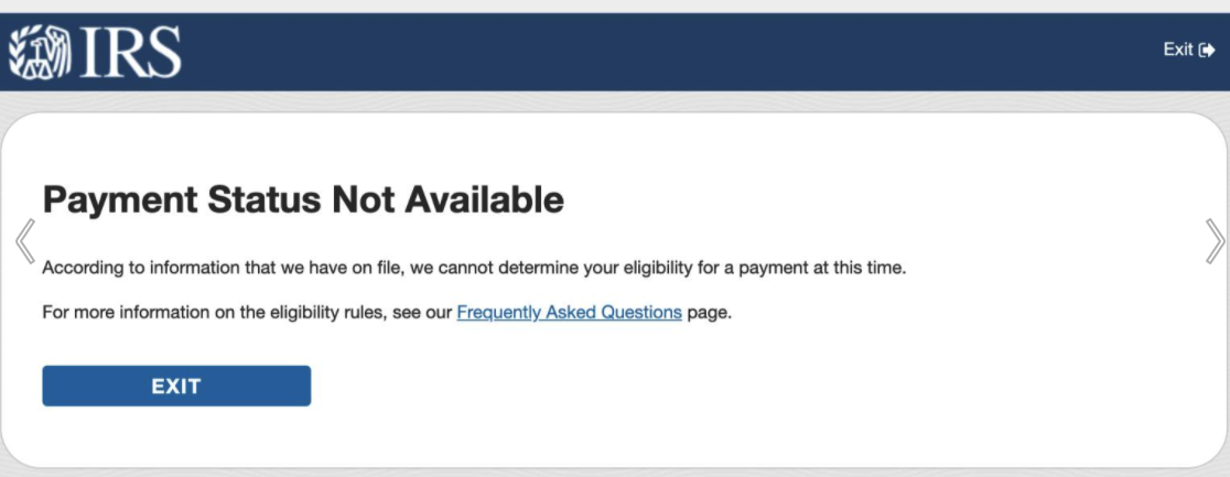
This messaging is vague, doesn’t set any expectations, and lacks empathy for frustrated users depending on this check to pay for their next utility bill.
The only thing of value it offers is pointing them to an FAQ page, but it still feels cold and devoid of empathy.
So how would a UX writer do it better?
Here’s how one UX writer on LinkedIn revised it:

Empathy level: 100
There’s a much clearer picture of what’s happening with the payment. The simple use of the word “yet” implies that while the information isn’t available at this time, it will be at a later date.
The rest of the body copy accentuates that point, and provides a specific date to make it crystal clear to users when they can expect to check again.
It’s a message full of empathy and understanding.
However, in my personal opinion, I think even this message can be further improved in two ways:
Less apologetic: I believe this messaging may be a little too apologetic in terms of messaging. Why? Because in cases like this, it’s often not due to a particular fault of anyone(a large batch payment to all Americans may take time)…and I’d imagine the style guide for government properties like this refrains from overusing an apologetic tone if possible.
Too wordy: This exceeds the character count and attention span for many people who just want a simple explanation for what’s going on with their payment.
Here’s how I would write it:

Solution: Clear, concise, and appropriate for an IRS communication.
Writing for the web and interfaces is a lot like writing a joke, as both disciplines require a deep understanding of human psychology, context, and empathy. Poor communications can result in a backlash of complaints, confusion, and more work for the content creators down the road. A joke that doesn’t speak on a human truth, or needs more information to be explained, typically results in a light chuckle, silence, or worst of all, boredom.
By implementing the three rules of good UX writing: clear, concise, and useful - and balancing the right tone of empathy and tone, we can achieve better user experiences across all industries.
🔍 Related: What is UX writing?
=====
Now you’ve read this, you might also be interested in: