3 subtle rules for elegant content
Although there’s nothing wrong with illustrations or bulleted lists — they help break up dense paragraphs and enhance readability — there’s more you can do.
Avoid ‘hanging lines’ for neat-looking paragraphs
A ‘hanging line’ is my loose translation from Russian ‘висячий абзац’.
A hanging line occurs when the sentence ends with between one and three words in a new line.
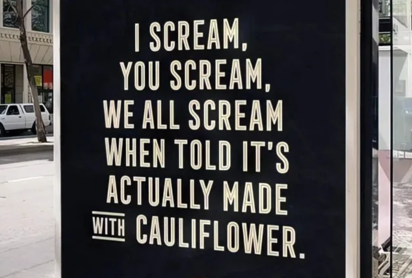
Like this:

As a rule, if the words in the last line of text take up less than 50% of space, try to cut them out or add words so that the paragraph looks even:

The changes are subtle but help long texts look clean and professional.
Write titles that ‘speak’ as much as the rest of the text
It’s amazing when all the information needed and the main message of a paragraph are already reflected in the title. Don’t be greedy with useful info — don’t hide it.
And, don’t underestimate the impact of a title. It’s a powerful tool that shouldn’t be taken for granted. A well-crafted title should be more than just a catchy phrase; it should be a succinct paragraph summary.
Hyperlinks stand out visually, so make them informative
Nielsen Norman Group (NNG), one of the best UX study labs in the world, says that our eyes are drawn to links. We can make use of this.
Hyperlink the message, not a random word. Too long is better than too short.
Hope this tiny post helps you.
Tiny changes make all the difference.
=====
Now that you’ve read this, you might be interested in